BMK Realty
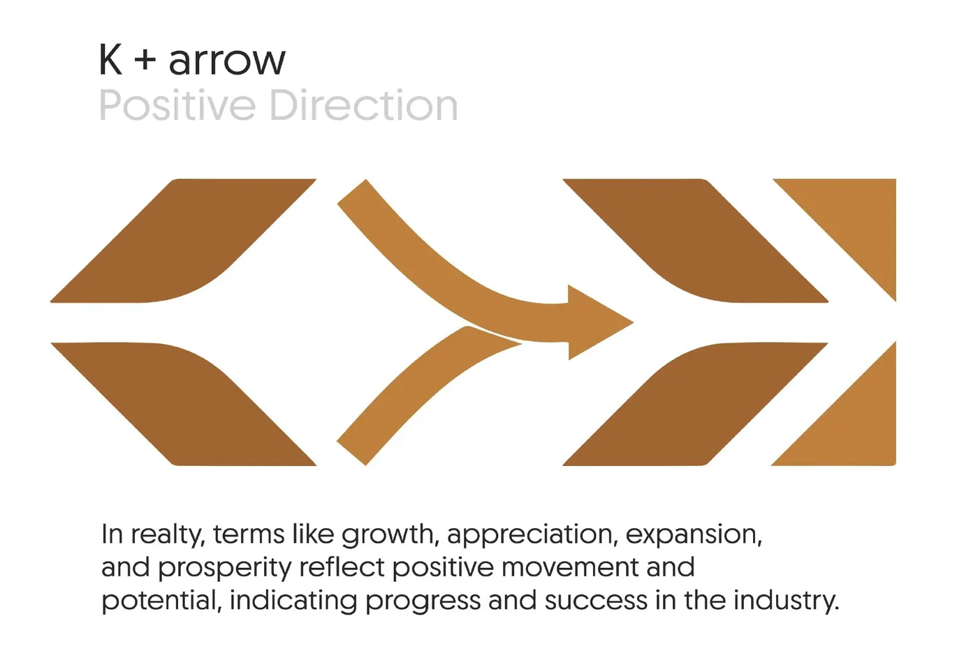
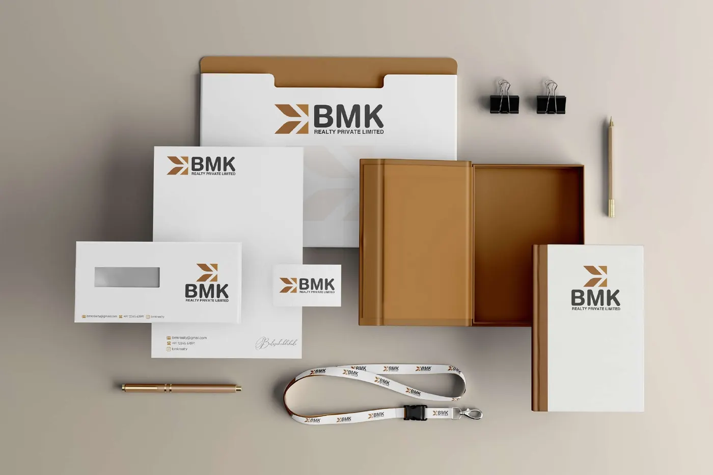
Logo and visual identity for a real estate brand, built on a K and an arrow for growth.
Overview
The project at a glance.
01
Challenge
A new real estate brand needed a mark that feels solid and premium, and says growth without using the usual house or key icons.
02
What we did
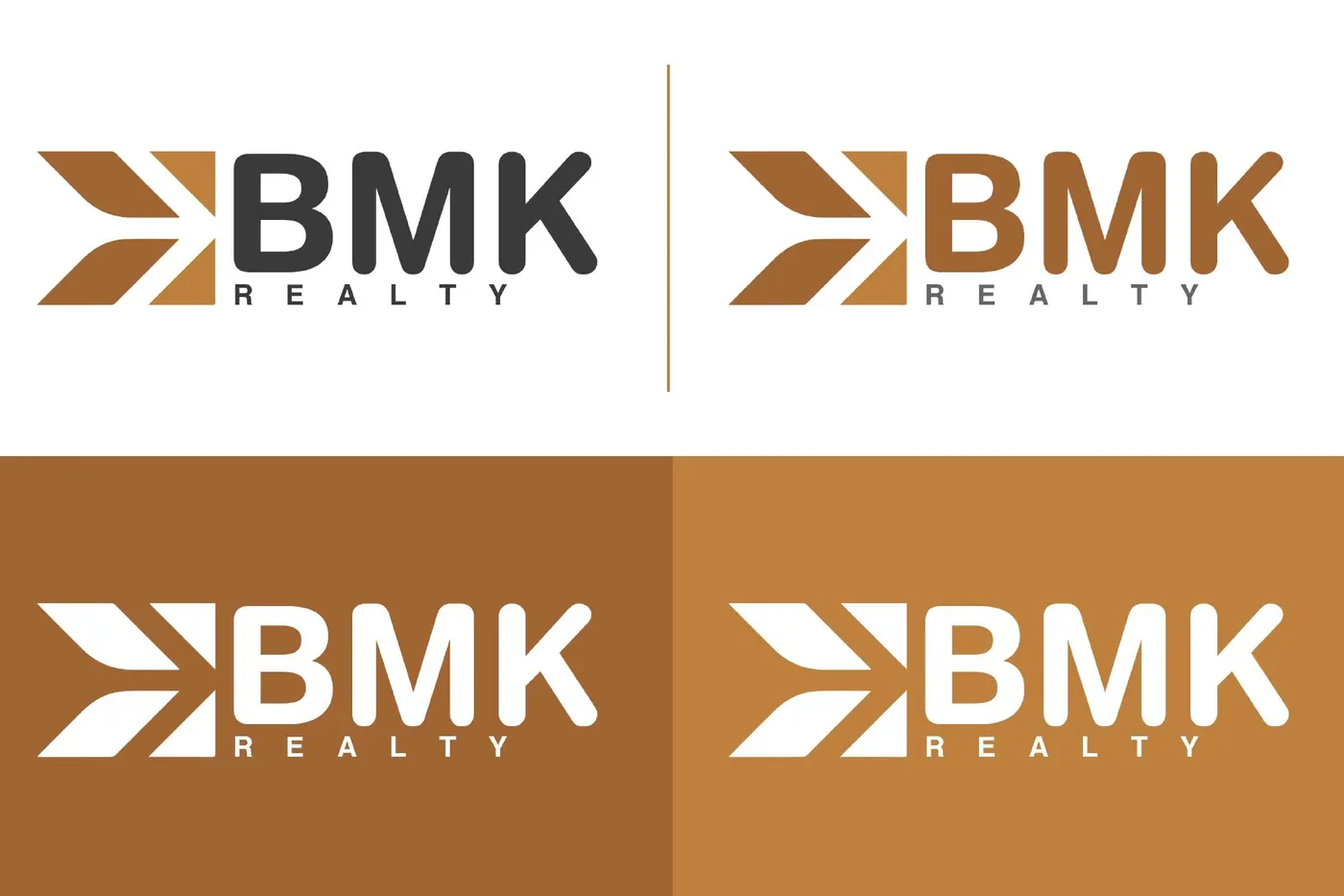
We combined the letter K with a forward arrow, set it in warm bronze and charcoal, and extended it into a pattern, colour palette and stationery set.
03 · Result
A simple, memorable mark that works on a visiting card, a site board and a brochure alike.
Gallery
Inside the project.
Need a logo with a story?